
When decorating a room with pictures, it’s important to ensure the images complement the current style of the space and help add visual interest without overwhelming it. You don’t want the images to consume the room but, at the same time, you also want them to stand out.
No set amount of pictures in a room constitutes “too many.” However, a lack of consideration for balance between blank space and visual design can make a room feel cluttered and chaotic. The size of the wall and the overall layout play a role in the number of images you should include.
In this article, I’ll explain whether it’s possible to have too many pictures on a wall or in a room. Additionally, I’ll discuss the importance of empty space and provide tips on how to avoid a cluttered look. Read on to learn more.
Can You Have Too Many Pictures on a Wall?
Pictures attract the eye, creating contrast between other decorative pieces in a room. They’re a good way to break up empty space or add additional design elements.
However, if you have pictures on every wall and every surface, they can distract, making a room feel overwhelming, cluttered, and “busy.” Too many photographs can even make a room appear smaller than it is.
Less is more when it comes to decorating with pictures; the best way to achieve a beautiful look is by maintaining balance between empty space and visual design.
That said, the right amount of pictures differs for everyone. It depends on personal preference, style goals, the room layout, and available space.
Some people prefer minimalist styles, whereas others favor more decorative designs.
No matter which style you’re going for, the goal is to opt for frames that complement each other and the surrounding decor.
Maintain a proper balance between blank areas and pictures, and position pictures based on their size and proportions.
Empty Wall Space Creates a Clean, Crisp Feel
Keep in mind that you don’t have to fill every bit of wall space or every tabletop with images — and you shouldn’t.
Although empty space may sometimes make a room feel cold and barren, the right balance between visual elements and blank space can give a room a clean, crisp feel. This makes it easier to blend all of the pieces in the room together.
If you feel that there are just too many blank areas, experiment with different pictures and other accent pieces.
For example, you don’t have to place a picture to break up empty wall space. You can also use tall vases, floor lamps, or indoor house plants.
The best way to decide which spaces to decorate and which to leave empty depends on the room itself, the space, and other pieces you’re incorporating.
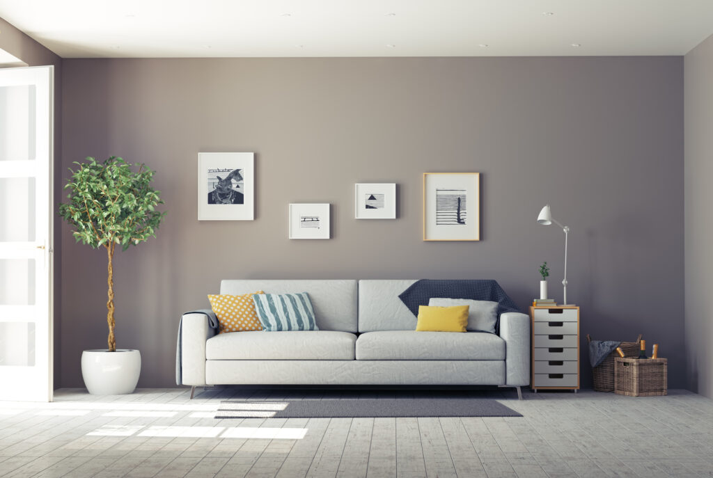
Don’t Overpower Focal Points
You don’t want pictures to overpower focal points.
For example, living rooms are areas for socialization. In most cases, the focal point is the television or fireplace.
Avoid placing so many pictures in the room that they “outdo” the main center point. Instead, keep all pictures smaller than the primary focal point, maintain a visual balance, and complement the focal point by adding images to adjacent walls.
Another example is the dining room. In these areas, the table usually stands out as the central focus, complemented with table runners or centerpieces.
Because dining room tables are usually quite large, you can decorate one wall with an extra-large image, preferably a blank wall that runs perpendicular to the table. Alternatively, you can create a gallery wall on a wall running parallel to the table.
To reiterate, unless you intend the picture to be the focal point, do not make it larger than the furnishings in the room. Otherwise, the picture will “swallow” the room, taking over any other elements you’ve incorporated.
How To Avoid the Cluttered Look
Don’t Over-Design
It’s easy to “over-design” small rooms with pictures. Hallways are a great example. These narrow pathways can easily appear smaller if there’s no blank space.
It’s best to line these areas with a short line of small photos or a narrow gallery wall. You can also implement mirrors to give the illusion of a wider space.
When decorating around tall furniture, don’t place images above the piece — place it along the side or add framed photos to adjacent tables.
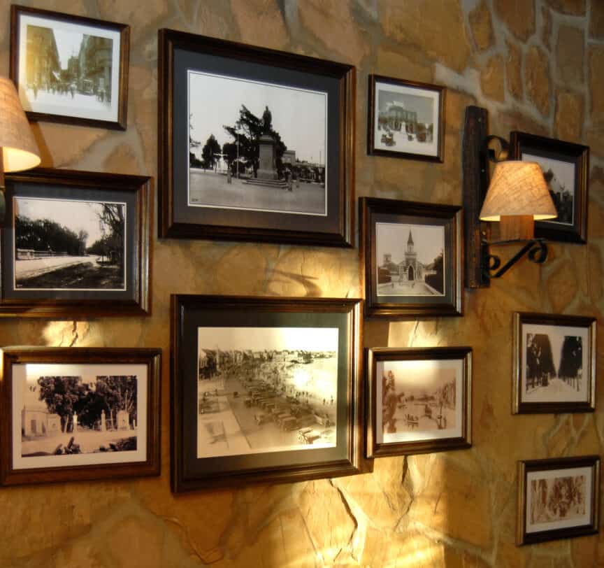
Choose Complementary Frames
Though it’s perfectly fine to experiment with different frame patterns, colors, sizes, and shapes, it’s easy to get carried away and end up creating a space that appears overdone and chaotic.
It’s best to choose similar frames. They don’t necessarily have to be the same size or shape, but they should at least share one feature.
If you’re dead set on using completely different frames, ensure that the photographs have similar visual elements (i.e., water, green space, etc.) to make everything easier to blend. Additionally, ensure the frames mesh well with the overall decor of the room.
Don’t Overdo The Gallery Walls
Gallery walls are great conversation pieces that draw the eye to the space, and can really make a room feel cozy and elegant.
With that said, a gallery wall in every empty corner of a room is overwhelming and distracting. Instead, opt for a single gallery wall per room, but only if there’s a large empty space. Keep adjacent walls blank or break them up with tall furnishings or other decorative elements.
Symmetry or Asymmetry Depends on You
Some people like the cleanness of symmetry whereas others prefer the abstract look of asymmetry. What you choose depends on your preferences, but you should consider the pictures’ sizes in comparison to the wall.
Whether you’re using four of the same frames, evenly spaced in a row or different-sized frames to create a staggered arrangement, the pictures should be appropriately sized for the wall space.
A symmetrical arrangement on an extra-large wall can look void and tacky if the pictures are too small. On the other hand, an asymmetrical arrangement of large pictures on a tiny wall can easily consume the space.
Conclusion
Decorating with pictures requires a keen eye for detail and a good sense of design. For those who aren’t decoratively inclined, it’s best to start as small as possible.
By using the appropriate balance of space and the right shapes, sizes, and layouts, you can easily define a space based on your decorative goals.
On the contrary, the wrong shapes, sizes, or layouts can turn an otherwise gorgeous room into a cluttered, chaotic mess.
Moderation is key — pictures add visual interest and improve the overall impression of a space. They should also help to blend all other elements together.
Sources
- Homes & Gardens: Negative Space in Interior Design
- New York Institute of Art + Design: How To Accessorize a Blank Wall
- New York Institute of Art + Design: How To Make a Gallery Wall
Share this Post
Giovanni Valle is a licensed architect and LEED-accredited professional and is certified by the National Council of Architectural Registration Boards (NCARB). He is the author and managing editor of various digital publications, including BuilderSpace, Your Own Architect, and Interiors Place.